Skip to main content

This article will be useful for both testing specialists and newbies as soon as the process of GUI testing is represented here as completely as possible.
GUI testing can be performed from three points:
- Usability
- Design, appearance
- Element arrangement, layout.
The first two points are discussed well in the article by Elena Osadchaya “GUI Testing: Basic tips” [1]. Information concerning element arrangement testing can be found on the Microsoft site [2] and that is what we will talk about in this article.
Contents
Introduction
1. Composing test plan for GUI testing
2. Tools and documents
3. Reporting
3.1. Test documentation
3.2. Bug reports for GUI element arrangement testing
3.3. GUI element arrangement testing report
Conclusion
References
Introduction
Imagine a window where all elements are aligned perfectly and the style remains consistent in all of elements, tabs and boxes. Such harmony will be very pleasant to the eye and a user will enjoy it for sure.
In this article you can find answers for such questions:
- How to compose test plan for element arrangement testing
- What tools are better to use and why
- How to compose test documentation and report testing results
1. Composing test plan for GUI testing
As we mentioned above we have an important task – to test element arrangement up to a single pixel. And first we should compose the main document, which will describe the testing process – test plan.
First of all we should choose the certain rule sets that are the most important for us and formulate them clearly. Then we divide an interface into parts: windows, tabs, functionalities… The individual test plan can be composed for each element in correspondence with the chosen documentation scheme. We will compose testing documentation by the plan [1]:
1. Elements
– Buttons
– Checkboxes and radiobuttons
– Listboxes and comboboxes
– Editboxes
– Menus
– Windows, tabs, blocks
– Pictograms
– State line
– Input forms
– The structure of interface forms
– Text
– Interaction
– Keyboard
– Visual representation
– Indication
2. Arrangement
– Visual hierarchy
– Effective usage of screen space
– Element sizes.
Each point includes a list of nuances to pay attention at and the values of distance between elements in pixels. In a window where there are only checkboxes we check the corresponding requirements, skip the rest from “Elements” section and continue testing. If the interface part includes a lot of different elements we proceed by the list skipping the absent elements.
Let’s consider two tabs of computer properties window My computer -> Properties and test their interface (Fig. 1 and Fig. 2).

Figure 1. Automatic Updates Tab

Figure 2. RemoteTab
Using the list given above let’s make a draft of basic plan for composing the test plan:
- Properties windows
- Buttons OK, Cancel and Apply
- Distance between buttons in pixels
- Distance between buttons and borders in pixels
- Buttons Help and Close
- Tab Automatic updates
- Radiobuttons
- Comboboxes
- Pictograms
- Structure of interface forms
- Text
- Tab Remote
- Block alignment
- Block Remote Assistance
- Distance between the button Advanced and frame borders
- Allow Remote Assistance checkbox
- Text alignment inside the form
- Block caption alignment in pixels
- Block Remote Desktop
-
- Distance between the button Select Remote Users and frame borders
- Allow users to connect checkbox
- Text alignment inside the form
- Block caption alignment in pixels
-
Now we will look through this list along with the Microsoft recommendations and make the specific test cases. See the results below.
2. Tools and documents
Before start testing let’s se what tools can help us to count the pixels on the screen.
There are 3 the most widely used approaches:
- Ruler JRuler
- Microsoft Paint
- Adobe Photoshop
Let’s consider each one in detail.
JRuler is a small application to easily measure distance or sizes in pixels (Fig. 3). It’s interface is really a ruler where each pixel is marked by a scale line. A ruler can be both horizontal and vertical. The value that corresponds to the current cursor position on the screen is displayed inside. Holding the mouse left button you can easily move a ruler to the proper place. It is good to match the ruler left border with the first pixel of the considered interface part.

Figure 3. JRuler interface
Advantages of JRuler:
- Compact.
- There is Always on top option.
- Easy to use.
- Good-looking interface.
Disadvantages:
– The one pixel difference is very hard for eye to catch and so you have to scrutinize.
– The number of pixels is displayed in only one fixed place. If to put a ruler down you cannot see these numbers.
There are a lot of analogues: Jruler PRO, JR Screen Ruler, UDRuler and others.
Microsoft Paint. To use Paint we should first make a screenshot with application window and paste it to Paint. Then we choose View -> Zoom -> Large. And one more step: View -> Zoom -> Show grid. Now we can count the pixels (Fig. 4).
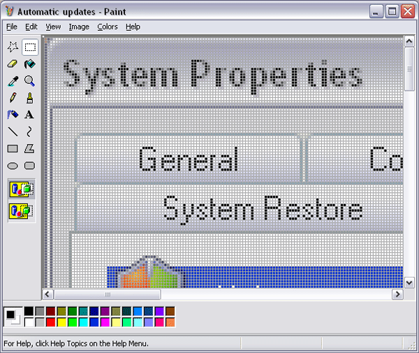
Рис 4. Large Zoom with grid in Paint.
We can also use Pencil tool to mark examined pixels by bright colors and thus make it easier to count these small countless cells.
Advantages of Paint:
- The size of pixels can be made larger.
- There is a grid.
- Color marking makes it easier to demonstrate the bug found.
Disadvantages:
– You have to make screenshots (additional time, efforts and attention).
– Zooming is not smooth.
– There is no ruler.
Adobe Photoshop. This program is a powerful graphics editor and thus it’s not surprising that it’s the easiest tool to deal with pixels. To start working we should make a screenshot and paste it to the new Photoshop document (Fig. 5).
Then choose:
- View -> Show -> Grid.
- View -> Rulers.
- Edit -> Preferences -> Guide, Grid & Slices ->
-> In Grid block we choose Grid every 1 pixel.
4) Edit -> Preferences -> Units & Rulers. In Units block we choose
Rulers: pixels, Type: pixels.
5) Zoom in.
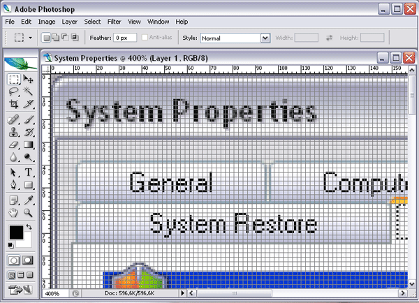
Figure 5. Editing in Photoshop.
Advantages of Photoshop:
- Smooth zooming.
- Ruler.
- Grid.
- Additional tools.
Disadvantages:
– Program window has to be maximized for the proper work.
– Screenshots should be made.
– It’s not cheap commercial product.
– You should have some special knowledge to work with this program.
As usual, each tool has its advantages and disadvantages. The best way is to have all of them and choose one each time depending on the specific situation.
3. Reporting
3.1. Test documentation
Let’s match the described above basic plan with the Microsoft distance table and represent as Excel spreadsheet.
After that we perform all tests using above mentioned tools and put the results to the table (Table 1). Each test performed has a mark in Status column: passed or failed. Test results can be aggregated to obtain the current quality level of tested object; we can use the formula:
QL = (Passed / Total) * 100%.
Then, as usual, we make a ticket for each failed test, make bug report and put it to the bug-tracking system. Below there are examples of bug reports. It may seems like these both tickets describe the same problem – failed distance – and one ticket would be enough. But actually the Microsoft table has two points:
– what distance between buttons should be;
– what distance between a button and window border should be.
And thus if you just indicate “failed” in test plan you will not give the clear answer what exactly is wrong. This situation also results in two peculiarities of making tickets about element arrangement:
- Pay close attention on details.
- Give a screenshot by all means.
When all test cases are passed we form the project report, where all necessary testing details are described. Usually this report is sent to all developers and testers in the project team as well as project manager.
And finally the examples of bug reports and project GUI testing report are given below.
Table 1. Test plan and test passing results.
|
Responsible: Futornyak Elena |
|
|
Configuration: Windows XP SP3 x86 |
|
|
Quality Level = |
86,67% |
|
Total = |
30 |
|
Passed = |
26 |
|
Failed = |
4 |
|
Test name |
Status |
|
My computer -> Properties |
|
|
OK button have 75 x 23 size in pixels |
passed |
|
Cancel button have 75 x 23 size in pixels |
passed |
|
Apply button have 75 x 23 size in pixels |
passed |
|
OK, Cancel and Apply buttons have the same vertical aligning |
passed |
|
Distance between OK and Cancel buttons is 7 pixels |
failed |
|
Distance between Cancel and Apply buttons is 7 pixels |
failed |
|
Distance between Apply button and bottom window border is 11 pixels |
failed |
|
Distance between Apply button and right window border is 11 pixels |
failed |
|
Help button is in the right top corner of the window |
passed |
|
Close button is in the right top corner of the window |
passed |
|
Automatic updates tab |
|
|
Name of tab has center aligning |
passed |
|
4 radio-buttons have the same horizontal aligning |
passed |
|
There is no radio-button selected by default |
passed |
|
Two combo-boxes are disabled when first option is not selected |
passed |
|
After selecting first option two combo-boxes are enabled |
passed |
|
Date combo-box has default value |
passed |
|
Time combo-box has default value |
passed |
|
Red and green icons have the same size |
passed |
|
Red and green icons have the same horizontal aligning |
passed |
|
First paragraph and radio-buttons have the same horizontal aligning |
passed |
|
Remote access tab |
|
|
Two frames have the same width |
passed |
|
Two buttons in frames have the same right aligning |
passed |
|
Checkboxes in two frames have the same horizontal aligning |
passed |
|
Remote helper frame |
|
|
Distance between Advanced button and right frame border is 11 pixels |
passed |
|
Distance between Advanced button and bottom frame border is 11 pixels |
passed |
|
Distance between frame left border and frame name is 9 pixels |
passed |
|
Checkbox and frame name have the same horizontal aligning |
passed |
|
Remote managing frame |
|
|
Distance between Advanced button and right frame border is 11 pixels |
passed |
|
Distance between frame left border and frame name is 9 pixels |
passed |
|
Checkbox and frame name have the same horizontal aligning |
passed |
3.2. Bug reports for GUI element arrangement testing
[Ticket#1] Distance between OK and Cancel buttons is more than 7 pixels.
Module: My computer properties.
Version: Windows XP SP3 x86
Type: Design
Priority: Low
Steps to reproduce:
- Right-click My computer, open Properties window.
- Measure the distance between OK and Cancel button in pixels.
Actual result: The distance is 8 pixels. See screenshot 1.
Expected result: The distance is 7 pixels.
Note: The same distance is between Cancel and Apply buttons.
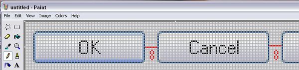
Screenshot 1.
[Ticket#2] Distance between Apply button and right window border is less than 11 pixels.
Module: My computer properties.
Version: Windows XP SP3 x86
Type: Design
Priority: Low
Steps to reproduce:
- Right-click My computer, open Properties window.
- Measure the distance between Apply button and right window border in pixels.
Actual result: The distance is 7 pixels. See screenshot 2.
Expected result: The distance is 11 pixels.
Note: The same problem is between Apply button and bottom window border. Distance is 8 pixels instead of 11.
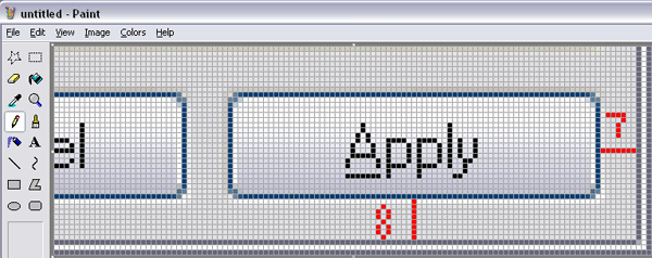
Screenshot 2.
3.3. GUI element arrangement testing report
Testing report
Module: My computer Properties window
Version: ftp://storage/out/Testing/2009-12-16/
Configuration: Windows XP SP3 x86
Type of testing: GUI testing
Results:
Automatic updates and Remote tabs were tested.
See Results in table:
|
Quality Level = |
86,67% |
|
Total = |
30 |
|
Passed = |
26 |
|
Failed = |
4 |
There were founded 2 new bugs:
[Ticket#1] Distance between OK and Cancel buttons is more than 7 pixels.
[Ticket#2] Distance between Apply button and right window border is less than 11 pixels.
Problems:
There were no problems.
Common vision:
Interface looks very good. GUI corresponds to almost all of Microsoft standards.
There are a few low-priority bugs.
Conclusion
In this article we managed to:
- Ground the complexity and importance of GUI element arrangement testing.
- Give an algorithm to compose test plan for testing of element arrangement.
- Compose and execute short test plan for an example.
- Consider three the most popular tools to measure distance in pixels.
- Illustrate words with examples of bug reports and project testing report.
References
- Elena Osadchaya «GUI Testing: Basic tips» https://www.apriorit.com/qa-blog/63-gui-testing
- http://msdn.microsoft.com/en-us/library/aa511279.aspx
Read more in our QA Blog – Software testing estimation techniques.