 Skip to main content
Graphical user interface testing is an essential part of quality assurance testing as it lets you look at your application from the user’s perspective. In this article, we’ll discuss how to automate desktop application GUI testing using Python and Pywinauto. This article will be helpful for quality assurance specialists who are looking for tools to automate Windows GUI testing.
Graphical user interface (GUI) testing is an essential part of quality assurance testing as it lets you look at your application from the user’s perspective. In this article, we discuss how to use Pywinauto and Python to automate desktop application GUI testing.
This Pywinauto tutorial will be helpful for quality assurance specialists who are looking for effective tools to automate Windows GUI testing.
Graphical user interface testing is aimed at ensuring that the graphical user interface (GUI) meets specifications. User interface (UI) testing covers the user’s interactions with the application through a command line or graphical controls. During GUI testing, a quality assurance (QA) specialist tests the functionality of the application through its graphical controls (icons, text fields, buttons) and evaluates the controls. This type of testing can be both manual and automated. Windows GUI testing automation using Python emulates a user’s interaction with the GUI using automation tools.
According to Mike Cohn’s book Succeeding with Agile, UI testing is at the top of the test automation pyramid:
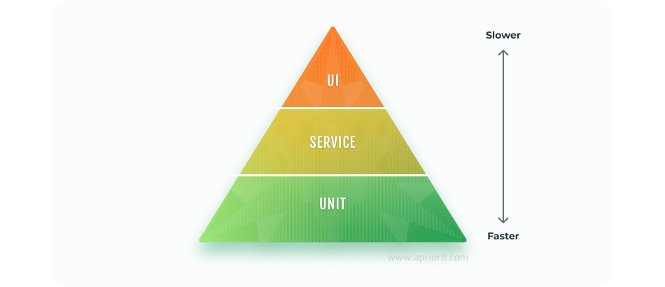
This means that UI tests should take less time and effort in comparison with unit and service tests. While unit and service tests are more isolated, they uncover application bugs at the early stages of software development. In contrast, UI tests can be conducted only at the latest stages of the development lifecycle.
The main advantage of Windows GUI testing automation with Python is that it looks at the application under test from the user’s perspective. In this way, desktop application testing automation using Python complements unit tests and service or API tests.
Want a bug-free solution?
Make sure to deliver an efficient Python application by delegating development and testing activities to Apriorit’s professionals.
How to install Pywinauto
Pywinauto is a set of libraries for Windows GUI testing automation with Python.
You can install the Pywinauto package by running a standard pip command:
pip install pywinautoNote that installing the 64-bit version requires running the 64-bit Python interpreter:
C:pathtopython_64bit.exe -m pip install pywinautoPywinauto supports the following Windows GUI technologies:
- Win32 controls through the Win32 API: MFC, VB6, VCL
- MS UI Automation: WinForms, WPF, Qt5, browsers, store apps
However, it doesn’t support Tkinter, Java AWT/Swing, or GTK+.
GUI tests take the form of Python scripts that consist of Pywinauto library methods, which emulate user actions like mouse clicks/movements and keyboard key presses.
These Python GUI automation testing libraries provide an important benefit of accessing the GUI control elements with the help of attributes. For instance:
app.SaveAs.Save.click()Here, we use the full stop to access the Save button that’s located in the Save As dialog window and call the click method.
Steps of GUI test automation with Pywinauto
There are five main steps of writing a GUI test with Pywinauto:
- Run an application or access a running one.
- Define the main application window.
- Find the necessary control element (button, text field, drop-down list, etc.).
- Perform a user action on the control element (click on the button, enter text, etc.).
- Check the results.
Let’s automate Windows GUI application testing using Python and Pywinauto. Here are the main steps of of editing and saving a Notepad file:
- Open a text file in Notepad.
- Enter a text and apply formatting to it: for instance, Comic Sans, bold, size 18.
- Save the file in PDF format with the following settings: landscape orientation, paper size A3.
- Check if the PDF file was saved.
Below, we provide a guide for executing this test with pywinauto.
Read also
How to Use Python for Automation Testing: Building a QA Framework from Scratch
Take the most out of Python for your test automation. Save the time of your quality assurance engineers while still ensuring the delivery of a high-quality product.
Running the application under test: Notepad example
To call the main Notepad window and its control elements, we need to run the application and create a new text file in it. The Notepad file is initialized in the following way:
# Import pywinauto Application class
from pywinauto.application import Application
# Start a new process and specify a path to the text file
app = Application().start('notepad.exe', timeout=10)
In this example, Pywinauto runs notepad.exe as a separate process and opens a new file with a 10-second timeout and 10 retries. This way, we can make the testing process a bit smoother, as the application under test can display its windows and GUI elements with a certain delay. By default, Pywinauto looks for an open dialog window and control elements during a certain period of time (approximately 5 seconds) and repeats the search if it fails.
There are also several alternative ways of accessing an application that’s already running. You can specify the process ID (PID), path to the executable, or regular expression for window name identification.
# Connect to already running process:
# By PID
app = Application(backend="uia").connect(process=1234)

# By path to executable
app = Application(backend="uia").connect(path=r"C:\Windows\System32\Notepad.exe")

# By regular expression
app = Application(backend="uia").connect(title_re=".*Notepad*")
The name of the window or control element can be specified with a regular expression or a name written without spaces or other breaking symbols. Pywinauto will automatically search for the element that most closely matches the name among all opened windows.
Related project
Supporting and Improving Legacy Data Management Software
Explore a success story of updating a containerized Python-based legacy solution for data synchronization. Find out how we helped our client ensure efficient support of their software and improve user experience.

Windows specification
To access control elements, you need to let Pywinauto define the application window with these elements. In our case, it’s the Notepad window.
Windows Specification is an object that describes either the application window or the control element. In our scenario, the window can be specified in the following way:
# Main window specification
main_dlg = app.UntitledNotepad
main_dlg.wait('visible')
Alternatively, you can describe the window with a regular expression of the title, or specify a particular name:
main_dlg = app.window(title='Untitled - Notepad')Pywinauto supports the most common GUI control elements, including:
- Button
- CheckBox
- RadioButton
- GroupBox
- ComboBox
- Edit
- Header
- ListBox
- ListView
- PopupMenu
- Static
- StatusBar
- TabControl
- Toolbar
- ToolTips
- TreeView
- UpDown
In order to display all available control elements for a specified window, you need to call the print_control_identifiers method:
# Print all controls on the dialog
main_dlg.print_control_identifiers()
This method allows you to see which control elements Pywinauto has access to and which of those controls need further desktop automation using Python.
Note: The method described above is not the only way to get the element’s locators. You can also use the following objects inspection tools for this task:
- Visual Studio Spy++. This tool is part of Microsoft Visual Studio distribution (even Express or Community) and is accessible through the Start menu. Spy++ uses Win32 API and has an analogue – AutoIt Window Info tool.
- Inspect.exe. This tool is part of the Windows SDK. Switch Inspect.exe into the UIA mode using MS UI Automation. If it can show more controls and their properties than Spy++, probably the UIA backend is your choice.
- SWAPY. This is an open source tool that allows locating the control elements and creating simple scripts for this elements.
You can call the control as an attribute of the window where the control is placed. A user action is applied to the element by calling the method.
In our case, after running notepad.exe, we should enter any text and apply formatting to it.
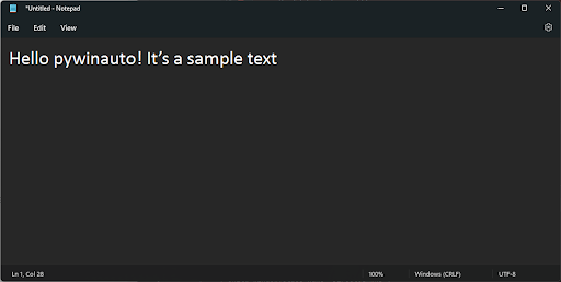
Enter text in the open document:
main_dlg.Edit.type_keys("Hello pywinauto!\n\t It’s a sample text^A",
                        with_spaces=True,
                        with_newlines=True,
                        pause=0.5,
                        with_tabs=True)
As a result, we’ll get entered text and indentation (due to the ^A command):
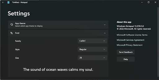
Now we’ll open the Font dialog window and edit the text font:
#Opening the Font Setting subtab
main_dlg.Edit.click_input()
main_dlg.PopupHost.Font.click_input(double=True)

#Changing the Font
main_dlg.FamilyComboBox.ListItem.click_input()
main_dlg.FamilyComboBox.select('Calibri')
'''OR app.UntitledNotepad.FamilyComboBox.Edit.type_keys("Calibri")
keyboard.press_and_release('enter')'''

#Changing the Style
main_dlg.StyleComboBox.select('Regular')

#Changing the Size
main_dlg.SizeComboBox.select('28')
main_dlg.BackButton.click_input()
Here, we used access to the following controls: the main window menu, ComboBox, and Button:
Now, we need to save the file in PDF format with landscape orientation and A3 paper size.
To do so, select a virtual printer through the Notepad menu:
  main_dlg.File.click_input()
  main_dlg.PopupHost.Print.click_input(double=True)
  appPrint = Application(backend=u0022uiau0022).connect(title=u'Notepad - Print', class_name='ApplicationFrameWindow', timeout=10)
  applicationframewindow = appPrint[u'Notepad - Print']
  applicationframewindow.wait("ready")

  # Select PDF printer
  applicationframewindow.Printer.select("Microsoft Print to PDF")
Then specify the document settings: landscape orientation, paper size A3:
# Open print preference
applicationframewindow.MoreSettings.click_input()
appPrintPref = Application().connect(title=u'Printing Preferences', class_name='#32770', timeout=10)
window = appPrintPref.Dialog
window.wait('ready')
# Set landscape
window.ComboBox.select("Landscape")
#Open advanced settings
button = window.Button2 #Advanced button
button.ClickInput()
# Select A3 size and save
paper_size = window['2', 'ComboBox']
paper_size.select('A3')
window.Ok.click_input()
appPrintPref.Dialog.print_control_identifiers()
appPrintPref.Dialog.OKButton.click_input()
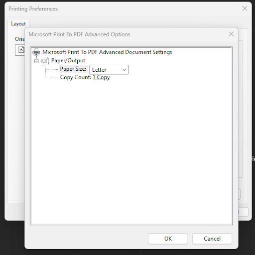
applicationframewindow.Print.click_input()Executing the script makes the following dialog windows open sequentially:
Print, PrintingPreference, and Microsoft Print to PDF Advanced Options.
There’s one peculiarity about the way Notepad runs processes and opens dialog windows: If we start Notepad in the 64-bit version of Windows with the help of the 32-bit Python interpreter and pywinauto, then notepad.exe is WoW64, or a 32-bit process, while the Print dialog window is a separate 64-bit process called splwow64.exe. This means that we can’t call the Print process from notepad.exe, but we can access it through a separate invocation by the process name or its PID.
However, we can call the dialog window from notepad.exe if we’re working on 32-bit Windows or run notepad.exe on 64-bit Windows through the 64-bit Python interpreter.
This peculiarity also relates to other applications where dialog windows are implemented in a similar way.
Finally, save the document and close Notepad:
# Save the file
save_dlg = Application().connect(title='Save Print Output As', timeout=10)
save_dlg.SavePrintOutputAs.print_control_identifiers()

file_path = f'D:\File\txt_to_pdf.pdf'
file_name_field = save_dlg.SavePrintOutputAs.FileName
save_dlg.SavePrintOutputAs.type_keys("%N")

save_dlg.SavePrintOutputAs.type_keys(file_path)
save_dlg.SavePrintOutputAs.Save.click()

# Clear the text and close Notepad
main_dlg.type_keys('{DELETE}')
main_dlg.close()
Read also
Windows Driver Testing Basics: Tools, Features, and Examples
Improve your driver testing strategy. Find out how detecting, localizing, and eliminating driver errors can help you decrease the risk of unstable system behavior for end users.
Waiting for long-running operations
When you conduct automated GUI testing, you often have to wait for certain events to complete, such as file loading, window rendering, and switching between windows.
In these cases, Pywinauto can wait for an event or you can set a timeout:
# Open a large file
app.OpenDialog.click()
# Wait for the dialog to become invisible
app.Open.wait_not('visible')
# Wait for up to 10 seconds until Report.txt is loaded
app.window(title='Report.txt - Notepad').wait('ready', timeout=10)
Checking the Windows GUI test automation results
You can also automate checking of the GUI test results depending on what is under the test. In our case, we can check the existence of the PDF file on the disk with standard Python methods, for instance, by calling os.path.exists.
Conclusion
Pywinauto Windows GUI automation can be a helpful addition to unit tests and API tests. However, when choosing automation tools, pay attention to their capabilities and usability features. Python Windows GUI automation with Pywinauto is quite easy. Pywinauto covers a huge number of Windows GUI technologies while providing easy access to graphical elements of tested applications.
Apriorit has a team of dedicated quality assurance specialists whose qualifications are confirmed with ISTQB certification. We also offer expert Python development services to help you enhance your projects.
Looking for developing user-friendly software?
Deliver a reliable and thoroughly tested Python application with the help of our experienced developers and QA specialists.


