 Skip to main content
Users today can access web applications from any device they have at hand, from a desktop to a smartwatch. For web developers and designers, such diversity creates a complex challenge: how to make the application usable and attractive on a huge variety of screens. And the answer to this challenge is by using responsive web application development practices.
In this article, we analyze the benefits of making your web app responsive and how responsive interfaces work from the inside. We also share best practices for implementing responsiveness into your web app and provide a practical example of creating a page layout with Bootstrap.
This article will be useful for web development leaders that are researching how to implement responsive web design in their applications.
Contents:
Why does responsive design matter?
Responsive web design is an approach to creating web interfaces that can adapt to various devices, screen sizes, windows, etc. Instead of a fixed layout, a web app gets several flexible interface layouts so it can adjust the content displayed based on the screen resolution. Usually, these include desktop, tablet, and mobile versions.
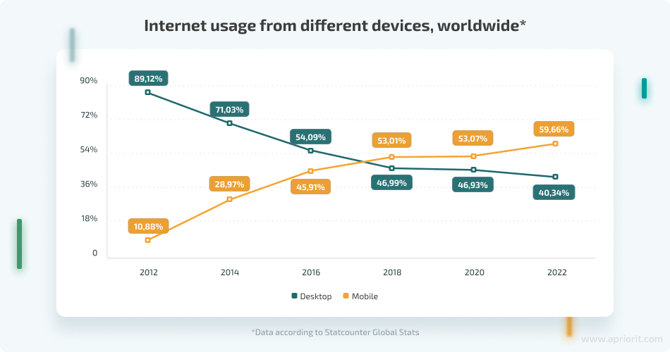
Responsive design is itself a response to users’ changing habits. The majority of people used to access the internet with desktops or laptops, but nowadays, more and more users access the web from mobile devices. Desktop and mobile devices have different screen sizes and aspect ratios, so websites and applications have to adapt.
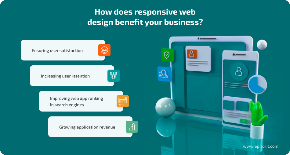
The key reason for using responsive design is to improve the user experience (UX) and to increase user engagement with your app. There are a million reasons for users to access your application from multiple devices, and if they encounter a flawless UX every time, they’ll be inclined to keep using the app and not look at alternatives.
At Apriorit, we have experienced the importance of responsive design in practice. During one of our projects, we were developing a desktop web application for a FinTech company that was intended to be used by accountants and HR managers. At some point, we started gathering usage metrics and discovered that over 40% of users were accessing the application from mobile devices. This was despite the complete absence of a mobile version or responsive interfaces.
When we updated the app design and made it responsive, we received excellent feedback from the clients and nearly doubled the number of mobile users within a year — now, the percentage of mobile users is slightly over 76%.
Сreating a responsive web app may seem a challenging task at first. Let’s see what exactly allows a web app to be responsive.
Want to discuss the best way to make your application responsive?
Reach out to Apriorit’s web development experts and leverage our experience!
What makes a web app responsive?
The responsiveness of a web application comes from several elements that can determine the size of the user’s screen and adjust page content accordingly.
Let’s look at the key elements in detail.
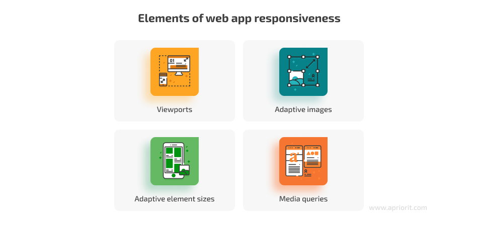
Viewports
In order for a web app to look good on different screens, it has to be able to adjust the size and position of elements, showing or hiding them depending on the screen size. The visible area of the screen in a browser is called the viewport. Responsive web apps use the viewport meta tag, which is necessary to instruct the browser on how to scale and calculate the width of the viewport. Here’s how this tag usually looks in an application’s code:
<meta name="viewport" content="width=device-width, initial-scale=1" />Adaptive images
To allow images to adapt to the size of the container, you can set them to have max-width: 100% and height: auto.
.responsive-image {
  max-width: 100%;
  height: auto;
}Note that if you use just width instead of max-width, an image may be stretched beyond its original size.
You can also load different images depending on the viewport size or the current device orientation with the following code:
<picture>
  <source srcset="/assets/city-hd.jpg" media="(min-width: 1500px)">
  <img src="/assets/city.jpg" alt="City View">
</picture>Preparing differently sized versions of images takes a bit of time, but it ensures that your web app displays images correctly.
Adaptive element sizes
You can define the size of any elements using units relative to the viewport:
- vw: 1vw = 1% of the viewport width
- vh: 1vh = 1% of the viewport height
While percentages are more common in responsive design, you can also configure elements to be a full-screen background image or make each section of a website occupy one screen, which is often used in the development of landing pages.
Media queries
Media queries allow you to apply CSS rules based on specific browser attributes, or user agents, including viewport size. This fundamental element of responsive design looks like this:
.block {
  width: 100%;
  font-size: 1rem;
}
/* Reduce the block size to 50% on screens larger than 1000px */
@media (min-width: 1000px) {
  .block {
    width: 50%;
  }
}
/* Reduce text size on screens smaller than 800px */
@media (max-width: 800px) {
  .block {
    font-size: 0.8rem;
  }
}
/* Hide the element on screens from 800px to 1000px*/
@media (min-width: 800px) and (max-width: 999.98px) {
  .block {
    display: none;
  }
}To avoid writing media queries manually, you can use a wide range of tools from frameworks with adaptive components that don’t require in-depth knowledge of CSS to small libraries of classes and Sass mixins that implement adaptive grids or simplify the process of writing media queries.
Now, let’s see what the best practices are for responsive web app development.
Read also
The Importance of Accessibility and Inclusiveness in UI/UX Design
Learn how developing an accessible application can help you attract more end users and increase your conversion rates.

4 core steps to implement responsive design
When researching how to implement responsive web design from scratch or introduce responsiveness to an existing application, you can start with the following practices:
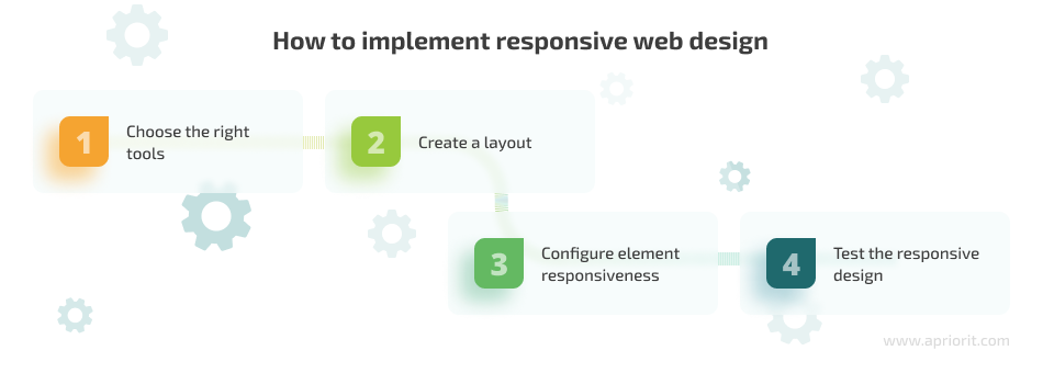
1. Choose the right tools
There is a wide variety of libraries and frameworks for developing responsive web applications. Libraries are pieces of CSS or JavaScript code that address specific tasks like implementing responsive grids, navigation menus, and autocomplete search elements.
Frameworks are collections of CSS or JavaScript code and rules describing all basic UI elements, such as navigation, form elements, dropdown menus, dialogs, and grids. Frameworks help to speed up building responsive web applications, as they let you easily compose basic predefined components as needed. Frameworks may be built upon or include libraries.
Some popular frameworks include Tailwind CSS, Bootstrap, Pure CSS, Ant Design, and Bulma. Each tool is designed for unique types of teams and issues they need to solve. To choose tools that are relevant for you, consider the following project parameters:
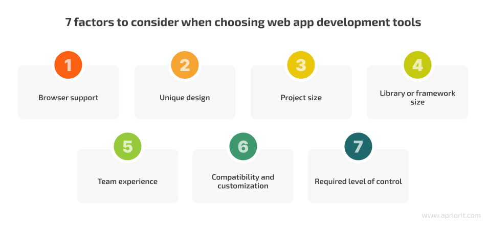
- Browser support. Determine which browsers and browser versions your application must support. This decision affects both your project budget and tool selection. For example, if you need your app to support Microsoft Edge, you may not be able to use the latest version of Bootstrap, so you might have to choose an older version or a different framework.
- Unique design. Examine your mockups and compare your design elements with the predefined blocks provided by different frameworks. Consider which tools allow you to achieve the desired look by configuring only colors, spacing, element size, and text.
- Project size. If your web app consists of only a few pages or is a single landing page, adding a framework may not be necessary. It could slow down your site’s loading time, and the development benefits may be negligible.
- Library or framework size. Keep in mind that the smaller the library or framework, the faster it will load. Assess whether you can include only the components you need in your application’s final build.
- Team experience. If your team has experience with a particular framework or library, that can be a strong argument in favor of using it. Developers and designers wouldn’t need to learn how to work with the tool, and using it would reduce the chances of human error.
- Customization. Assess if your design is compatible with a framework’s ready-made components. If not, research whether your tools allow the level of customization you need. Also, check that design customizations don’t increase the bundle size too much.
- Required level of control. If you want full control over the appearance and behavior of your interface elements and are ready to spend extra time on development and cross-browser support, consider rejecting frameworks and building the interface from scratch or using an adaptive grid library.
Ultimately, the choice of tools should align with your project’s unique needs and constraints.
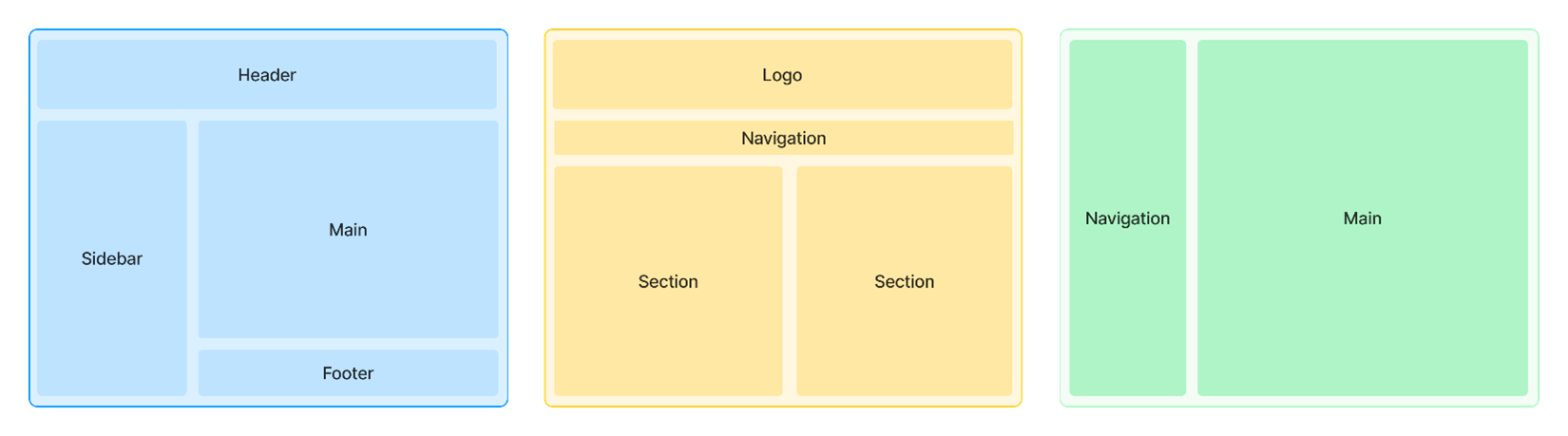
2. Create a layout
The layout defines the structure of your application, determining how to position the main elements of the website such as navigation, logos, sidebars, and main content. Here are some examples of common layouts:
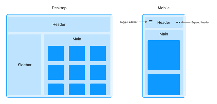
Let’s see how to create a simple layout and make it responsive. Our example application will have the following elements:
- A header that always remains at the top of the page and contains a menu that minimizes on smaller screens
- A sidebar that minimizes on smaller screens
- The main content block with a varying number of columns depending on the screen size
Here’s how it looks:
We’ll use the Bootstrap framework to write CSS code for this layout. Let’s start with the layout structure. Since Bootstrap doesn’t have pre-made components for layout creation, we first need to add the header, then the aside and main elements. Here’s how we can describe the layout of these elements using CSS Grid:
<header class="header">
    </header>
    <div class="layout">
      <aside class="sidebar"></aside>
      <main class="content"></main>
    </div>


.layout {
  display: grid;
  grid-template-areas: "sidebar main";
  grid-template-columns: 280px auto;
}
.sidebar {
  grid-area: sidebar;
}
.content {
  grid-area: main;
}Read also
Building a Microservices SaaS Solution for Property Management
Explore our case study about how we helped a client develop a SaaS platform and create convenient layouts for it.

3. Configure element responsiveness
When using Bootstrap for responsive web application development, the key responsive elements you can use are breakpoints and grids. Other frameworks provide similar design elements.
Breakpoints are width values that correspond to the average screen sizes of different devices. For example, extra small and small breakpoints are associated with smartphones in portrait and landscape orientations, medium with tablets, and large, extra large, and extra extra large with desktop computers.
| Breakpoint | Class infix | Dimensions |
|---|---|---|
| Extra small | None | <576px |
| Small | sm | ≥576px |
| Medium | md | ≥768px |
| Large | lg | ≥992px |
| Extra large | xl | ≥1200px |
| Extra extra large | xxl | ≥1400px |
Breakpoints are used in media queries to adjust the web app’s appearance for each device. They include many premade CSS classes that implement responsive behavior. These classes contain the breakpoint name within the CSS class name. For example, the d-lg-none class sets display: none for screens bigger than 992px, and the table-responsive-md class adds a horizontal scroll container if a screen is larger than 576 pixels.
You can also use Sass mixins from Bootstrap to write custom media queries:
// Using Saas mixin to create media query
@include media-breakpoint-up(xxl) { ... }


// Resulting CSS
@media (min-width: 1400px) { ... }The responsive grid in Bootstrap implements a 12-column system based on flexbox for building responsive and flexible UIs.
- Containers center the content and set its width. .container-fluid sets a width of 100%, and you can also set a maximum width based on breakpoints with classes like .container-md and .container-lg.
- Rows control the spacing between columns nested within them.
- Columns divide rows into vertical sections, and you can customize their sizes separately for different viewport sizes.
In the example below, a container with 12 columns is divided as follows: 2/12, 3/12, and 7/12 of its total width. This division remains the same for all screen sizes. Later in this article, we also discuss the use of a grid with adaptive classes.

Here’s how this grid looks in code:
<div class="container-fluid">
  <div class="row">
    <div class="col-2">col-2</div>
    <div class="col-3">col-3</div>
    <div class="col">the rest</div>
  </div>
</div>Header section
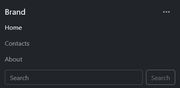
To implement the web app header, let’s use the navbar component of Bootstrap. This component supports responsive collapsing and fixed positioning out of the box. Let’s start by creating the header content: the logo, a three-item menu, and a search form.
<nav>
  <a href="#">Brand</a>
  <ul>
    <li>
      <a href="#">Home</a>
    </li>
    <li>
      <a href="#">Contacts</a>
    </li>
    <li>
      <a href="#">About</a>
    </li>
  </ul>
  <form>
    <input
      type="search"
      placeholder="Search"
    />
    <button type="submit">
      Search
    </button>
  </form>
</nav>Also, we need to add the button to expand the menu on a small screen and place it right next to the link to our brand.
<button type="button">
  <i class="bi-three-dots"></i>
</button>All that’s left is to add the CSS classes for the navbar component:
- .navbar for the container, which is the header element in our case. To support collapsing and expanding the menu, add the .navbar-expand-md class, and to support positioning, add the .sticky-top class. You can also specify a background and theme. For example, to choose the dark theme, add the .bg-dark class and the data-bs-theme=”dark” attribute.
- .navbar-brand for the brand link
- .navbar-toggler for the expand button
- .collapse .navbar-collapse for the container with elements that can be minimized on small screens. In our case, this includes the menu and form. To make this functionality work, provide the expand button with the ID of this element and add the Collapse plugin.
- .navbar-nav and .nav-item for the menu and menu items, respectively
As a result, the elements will be arranged in a row on medium (≥768px) and larger screens:

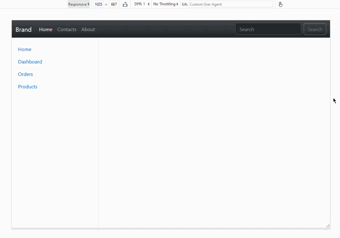
If a screen is less than 768px, the app will display all elements described in <div class=”collapse navbar-collapse ”>, and the contents of this block will be shown when a user presses the expand button.
Here’s the full resulting code of the header section:
<header class="header navbar navbar-expand-md sticky-top bg-dark" data-bs-theme="dark">
  <nav class="container-fluid">
    <a class="navbar-brand" href="#">Brand</a>
    <button
      class="navbar-toggler border-0"
      type="button"
      data-bs-toggle="collapse"
      data-bs-target="#navbarCollapse"
    >
      <i class="bi-three-dots"></i>
    </button>
    <div class="collapse navbar-collapse" id="navbarCollapse">
      <ul class="navbar-nav me-auto mb-2 mb-md-0">
        <li class="nav-item">
          <a class="nav-link active" aria-current="page" href="#">Home</a>
        </li>
        <li class="nav-item">
          <a class="nav-link" href="#">Contacts</a>
        </li>
        <li class="nav-item">
          <a class="nav-link" href="#">About</a>
        </li>
      </ul>
      <form class="d-flex" role="search">
        <input
          class="form-control me-2"
          type="search"
          placeholder="Search"
        />
        <button class="btn btn-outline-secondary" type="submit">
          Search
        </button>
      </form>
    </div>
  </nav>
</header>Read also
Building Cross-Platform Apps With React Native: How to Run an App on Multiple Platforms from a Single Codebase
Cross-platform support is a must have feature for modern apps, but its development comes with many challenges. Explore Apriorit’s practical guide on painless cross-platform development.

Sidebar section
We’ll implement the sidebar using the offcanvas component. It works similarly to a modal window: it can be displayed statically on larger screens and on top of other elements when a button is pressed on small screens.
We’ll be using the following classes:
- .offcanvas-lg to show the element if the viewport width is lg or smaller and otherwise hide it
- .offcanvas-start to position the sidebar on the left
- .offcanvas-header and .offcanvas-title to define styles for the header. Bootstrap also recommends including a close button in the header.
- .offcanvas-body as a container for the main content
Here’s the main body of our sidebar:
<div class="offcanvas-lg offcanvas-start" id="offcanvasResponsive">
  <div class="offcanvas-header">
    <h5 class="offcanvas-title" id="offcanvasResponsiveLabel">
      ...
    </h5>
  </div>
  <div class="offcanvas-body">
    ...
  </div>
</div>Now you can add a navigation menu and a button to close the menu in the header. When the offcanvas is shown within the main elements on a large screen, .offcanvas-header will be hidden.
<aside class="sidebar bg-body-tertiary">
  <div
    class="offcanvas-lg offcanvas-start bg-body-tertiary"
    id="offcanvasResponsive"
  >
    <div class="offcanvas-header">
      <h5 class="offcanvas-title" id="offcanvasResponsiveLabel">
        Navigation
      </h5>
      <button
        type="button"
        class="btn-close"
        data-bs-dismiss="offcanvas"
        data-bs-target="#offcanvasResponsive"
      ></button>
    </div>
    <div class="offcanvas-body">
      <div class="d-flex flex-column flex-shrink-0 w-100">
        <ul class="nav flex-column mb-auto">
          <li class="nav-item">
            <a href="#" class="nav-link active" aria-current="page">
              Home
            </a>
          </li>
          <li>
            <a href="#" class="nav-link"> Dashboard </a>
          </li>
          <li>
            <a href="#" class="nav-link"> Orders </a>
          </li>
          <li>
            <a href="#" class="nav-link"> Products </a>
          </li>
        </ul>
      </div>
    </div>
  </div>
</aside>You can also add a button in the header that allows you to display the offcanvas element when it’s hidden. To make this work, you need to specify the ID of the offcanvas element with the data-bs-target attribute and set data-bs-toggle="offcanvas". Insert the button before the element with the .navbar-brand class. To hide the button when the offcanvas is already displayed, add the .d-lg-none class.
Here’s the code for such a button:
<button
  class="sidebar-toggler d-lg-none"
  type="button"
  data-bs-toggle="offcanvas"
  data-bs-target="#offcanvasResponsive"
  >
  <i class="bi-list"></i>
</button>


.sidebar-toggler {
  background-color: transparent;
  padding: 0.25rem 0.75rem;
  border: none;
  color: var(--bs-navbar-color);
}Now the offcanvas element works correctly: it hides on small screens and appears on top of other elements when you press the button in the header. However, the aside element is still displayed because we positioned it before other elements using CSS Grid.
You can address this problem by adding a media query that splits the .layout block into .sidebar and .main for screens larger than 992px. Additionally, let’s stretch .sidebar to the full height of the page. You can do it by setting height: 100vh, but don’t forget to subtract the height of the header element.
.layout {
  display: block;
}
@include media-breakpoint-up(lg) {
  .layout {
    display: grid;
    grid-template-areas: "sidebar main";
    grid-template-columns: 280px auto;
  }
  .sidebar {
    padding: 1rem;
    height: calc(100vh - 3.5rem);
    position: sticky;
    top: 3.5rem;
    border-right: var(--bs-border-width) var(--bs-border-style)
      var(--bs-border-color);
  }
}
.sidebar {
  grid-area: sidebar;
  margin-left: -0.75rem;
}Here’s how the sidebar looks on a large and a small screen:
Main element
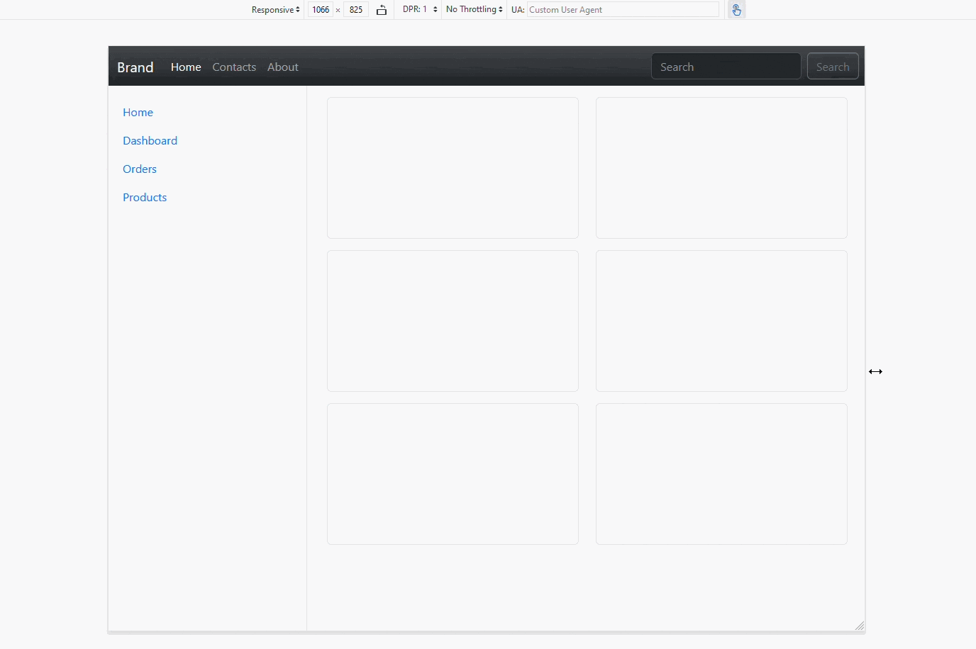
The main block has to be able to adapt its content to various screens. It should display:
- three items in a row for users on desktop computers
- two items for those viewing on a tablet or in landscape orientation on a smartphone
- one item on smaller screens
These items could be products in an online store, photos in a gallery, or user profiles on a social network.
Note that while we describe the layouts for tablets, computers, and smartphones, we work exclusively with screen width and not device models with specific screen sizes. If you need your web app to support specific devices and their screen sizes don’t fit well with the default breakpoints, you can easily adjust the breakpoints using Sass files in the Bootstrap framework.
In this example, we show you how to use a grid with adaptive classes. First, let’s create a container and a row, then define the columns.
Start with computer screens and divide them into three identical columns, meaning each should take up four out of 12 grid parts. Adaptive classes use media queries to specify min-width, which means they will also be applied to larger breakpoints. For example, .col-lg-4 will be applied to lg, xl, and xxl screens unless coded otherwise.
To visualize the grid in the browser, let’s add an element with the .item class inside each column, to which we will define the height and other styles.
<main class="content">
  <div class="container-fluid">
    <div class="row">
      <div class="col-xl-4"><div class="item"></div></div>
      <div class="col-xl-4"><div class="item"></div></div>
      <div class="col-xl-4"><div class="item"></div></div>
      <div class="col-xl-4"><div class="item"></div></div>
      <div class="col-xl-4"><div class="item"></div></div>
      <div class="col-xl-4"><div class="item"></div></div>
    </div>
  </div>
</main>


.item {
  height: 200px;
  background-color: rgb(248, 249, 250);
  border: 1px solid rgb(222, 226, 230);
  border-radius: 0.375rem;
  margin-bottom: 1rem;
}Now, let’s make a two-column layout for tablets by adding the .col-sm-6 class:
<main class="content">
  <div class="container-fluid">
    <div class="row">
      <div class="col-sm-6 col-xl-4"><div class="item"></div></div>
      <div class="col-sm-6 col-xl-4"><div class="item"></div></div>
      <div class="col-sm-6 col-xl-4"><div class="item"></div></div>
      <div class="col-sm-6 col-xl-4"><div class="item"></div></div>
      <div class="col-sm-6 col-xl-4"><div class="item"></div></div>
      <div class="col-sm-6 col-xl-4"><div class="item"></div></div>
    </div>
  </div>
</main>Finally, you only need to create a one-column layout for small screens. In fact, this layout already works because Bootstrap is based on a mobile-first strategy. Its components are by default optimized for mobile devices and can be changed with classes to fit devices with bigger screens.
In the end, here’s how the web app looks on different screens:
4. Test the responsive design
Testing how your application adapts to various screens allows your team to verify that the content is displayed correctly and is easily readable on target devices. There are several ways to test adaptive design during development.
The simplest and most intuitive way is to resize the browser window when working with your app. However, this method isn’t very convenient because you have to constantly adjust the window to very specific sizes, measuring the exact number of pixels to test the responsiveness.
Modern browsers include tools that simplify this. In Firefox, you can open these tools by clicking the Responsive Design Mode button. In Google Chrome, you can use the Toggle device toolbar at the top of the developer tools.
The parameters of these tools apply only to the current tab, allowing you to choose from predefined device profiles or create your own. You can also use the Responsive mode in Google Chrome to manually adjust sizes. These tools offer additional features like simulating screen rotation (switching width and height), touch events (translating mouse events into touch events), and more.
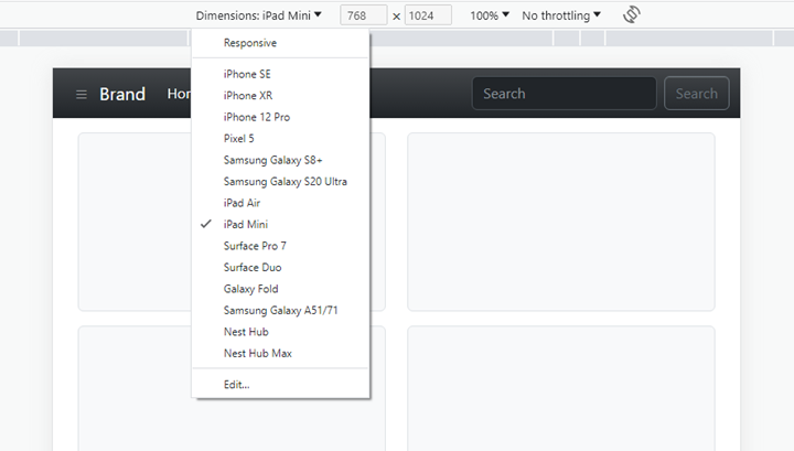
It’s essential to deeply understand how testing tools work and what exactly you can test with them. While you may think that choosing a specific device profile, like iPhone SE, allows you to test how your web application looks on that exact device, it’s not quite the case. Developer tools in browsers don’t emulate different devices; they only set viewport sizes, screen pixel ratios, and user agents matching the selected device profile.
This way, you can test your media queries and check whether the layout changes correctly at the specified viewport sizes. However, you can’t be certain that your site loads and functions on an actual device as it does in the developer tool. To verify that, you must conduct testing either with real devices or with specialized virtualization services like Sauce Labs and BrowserStack, which allow testing on real devices without physical access to them.
Conclusion
Responsive web application design and development help you to improve user satisfaction with your product by making it easy to use on any device. Responsiveness allows an application to adapt its content to a user’s screen, making it convenient to read and interact with.
Choosing the right tools to make an application adaptive may seem challenging since there are a lot of approaches, libraries, and frameworks. However, it’s worth investing time in selecting the most suitable solution for your needs because mistakes at the planning stage can significantly increase your budget and decrease the quality of your product.
When our web development team works on a new web project, we always pay attention to the app’s requirements and user needs. We help our clients deliver apps that will attract users, retain their attention, and satisfy them.
Looking into creating a web application?
Leverage our experience to make it responsive, performant, and convenient for your users!
Have a question?
Ask our expert!
VP of Engineering


